Мой музыкальный лейбл работает с данными шести платформ — Spotify, Apple Music, YouTube, Instagram, TikTok, UnitedMasters. Я уже собрал финансовую систему, и следующим шагом был аналитический дашборд, который свяжет всё воедино: стримы, роялти, аудиторные потоки, P&L по каждому треку. Мне нужен был дизайн для него. Не вайрфрейм. Не мудборд. Реальное, продакшен-качества визуальное направление, которое можно передать инструменту для кодинга со словами «собирай это».
Старые варианты: нанять дизайнера ($500–5000 в зависимости от страны, минимум две недели), освоить Figma (месяцы практики ради посредственного результата) или попросить ChatGPT описать layout словами и надеяться на лучшее.
Я не стал делать ничего из этого. Я использовал Variant, чтобы сгенерировать 24 полноценных макета за 20 минут, а потом с помощью Claude разобрался, какие элементы каких макетов реально хороши — и почему. Всё это не стоило ничего сверх инструментов, за которые я и так плачу — Variant за $20/месяц и Claude за $100/месяц — и дало дизайн-направление более строгое, чем большинство агентских брифов, которые я видел.
Вот метод.
Шаг 1: Генерируй, не оценивая
Variant — это AI-инструмент для дизайна, который генерирует полностраничные UI-макеты на основе комбинации текстовых промптов, референсных сайтов и ваших собственных изображений. Именно эта комбинация делает его мощным — вы не просто вбиваете описание в пустоту. Вы подаёте визуальный контекст с нескольких сторон.
Я начал с того, что выбрал три сайта, ощущение от которых мне нравилось — не дашборды, просто сайты с нужной энергетикой. Добавил их как референсы в интерфейсе Variant (буквально нажимаешь «add reference» и вставляешь URL). Потом загрузил скриншот фирменного визуала нашего лейбла. Поверх всего этого набрал промпт в одну строку: «analytics dashboard for a music label, dark mode, shows revenue and streaming data». Нажал «сгенерировать».
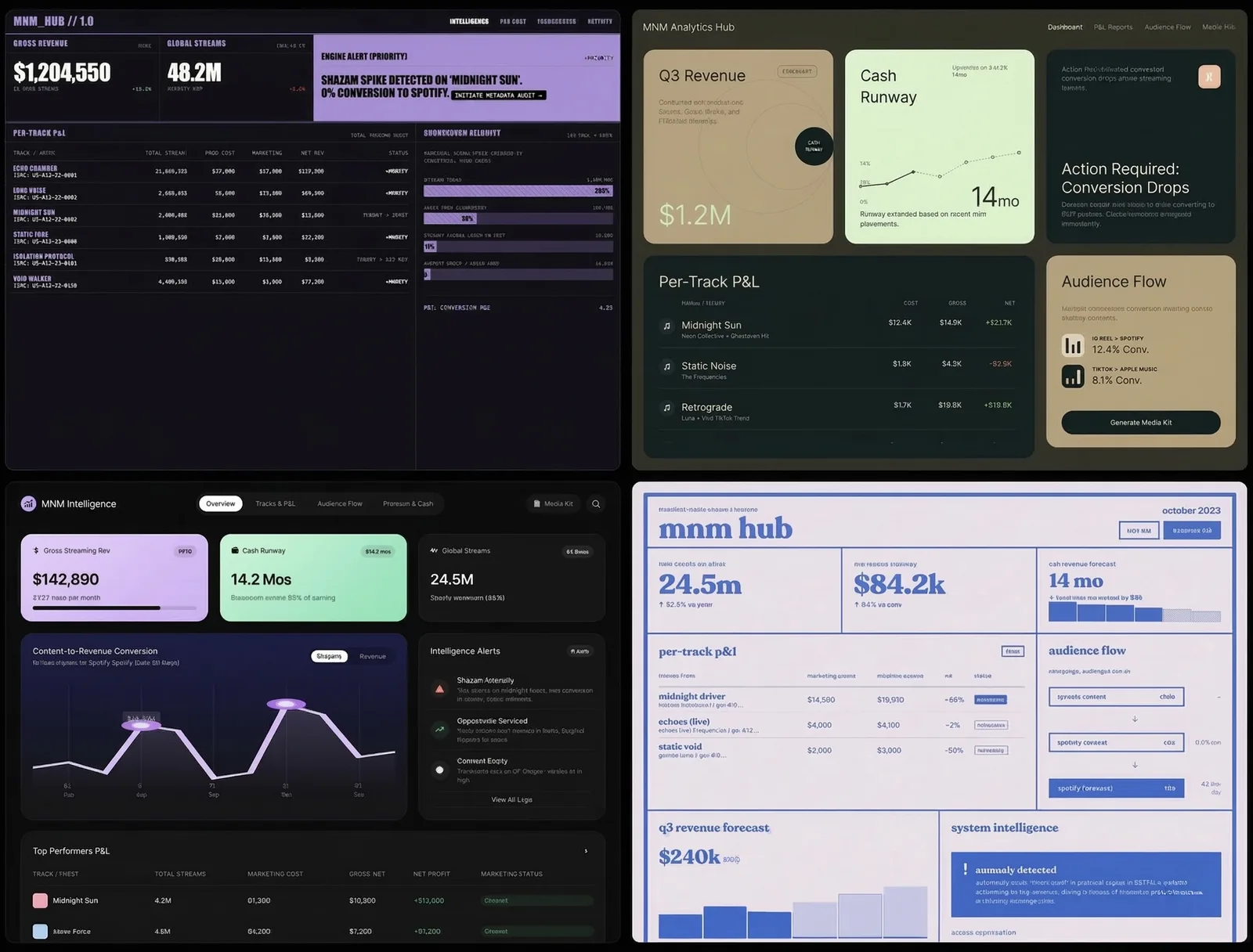
Появились четыре макета. Какие-то интересные, какие-то нет. Прокрутил вниз. Ещё четыре. Ещё раз прокрутил. Ещё четыре. За 20 минут у меня было 24 совершенно разных дизайн-направления — тёмный премиум с золотыми акцентами, минималистичный editorial, bento-box раскладки, газетный брутализм, терминал в стиле киберпанка, швейцарский модуляр, ретро-инди-журнал. Стили, о которых я бы и не додумался попросить.
Ключевой инсайт: не оценивай во время генерации. Просто продолжай. Вкус включится потом, и он работает лучше, когда есть из чего выбирать.
Шаг 2: Пусть AI станет дизайн-критиком
Вот тут начинается самое интересное. У меня было 24 красивых макета. Интуиция говорила, что три или четыре из них «ощущаются правильно». Но интуиция — плохой способ проектировать инструмент, которым люди будут пользоваться каждый день.
Я сделал скриншоты — по четыре макета на изображение, шесть изображений — и загрузил их в Claude. Сказал: опиши каждый макет, а потом скажи, какие элементы дизайна лучше всего работают по двум параметрам. Первый — читаемость и генерация инсайтов: что делает дашборд реально полезным. Второй — дофамин и вовлечённость пользователя: что заставляет людей захотеть открыть его снова завтра.
Claude взялся за работу. Исследовал лучшие практики дизайна дашбордов 2026 года, проанализировал каждый из 24 вариантов на соответствие этим практикам и вернулся с конкретными выводами.
Вот часть находок: bento-box раскладки (карточки разных размеров) — самый сканируемый паттерн в 2026 году, они позволяют каждой метрике быть самодостаточной. Тёмная тема — не эстетическое предпочтение, а функция: 82% пользователей её включают, и данные лучше выделяются на тёмном фоне (но тёмно-серый, а не чёрный, иначе устают глаза). Один главный график побеждает пять мелких — мозг лучше обрабатывает одну сложную визуализацию, чем несколько простых. Текстовые ленты с алертами создают дофаминовую петлю ожидания — пользователь открывает дашборд, чтобы узнать, что обнаружила система, а не потому что надо проверить цифры.
И главная находка: ни в одном из моих 24 макетов не было слоя психологического вовлечения. Ни анимаций-празднований, когда трек выходит на окупаемость. Ни счётчиков серий. Ни алертов о потерях. Ни индикаторов прогресса к цели. Все макеты хорошо справлялись с отображением данных, но ни один не отвечал на вопрос: а зачем человеку возвращаться?
Я бы не обнаружил ничего из этого, просто разглядывая макеты.
Шаг 3: Оптимальная комбинация
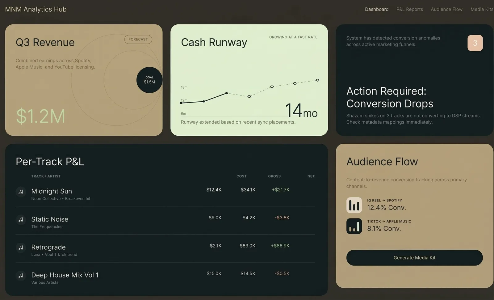
Claude выдал конкретный рецепт: взять bento-box раскладку из макета 4B, тёмно-золотую цветовую палитру из 1C, градиентную волну на графике из 3A, текстовую ленту с инсайтами из 3D, яркие блоки алертов из 6C. И добавить дофаминовый слой, которого нет ни в одном макете — конфетти на достижениях, счётчики серий, блоки с упущенными возможностями, прогресс-бары к целям.
Вот что важно. Ни один макет не был ответом. Ответом оказалась комбинация лучших элементов из шести разных макетов плюс слой, который AI определил как отсутствующий во всех.
Я взял этот рецепт и вернулся в Variant. Сгенерировал новую партию макетов по конкретному промпту, который написал Claude — с точными цветовыми кодами, структурой раскладки и описанием компонентов. Результаты оказались кардинально точнее. Вместо 24 случайных направлений я получил вариации одного сильного направления.
Шаг 4: Экспорт и сборка
Variant экспортирует в HTML или React. Я выбрал лучший результат, нажал «экспорт» и получил готовый к продакшену код. Отнёс его в Claude Code и сказал: вот дизайн, вот мои реальные данные (CSV из Spotify, Apple Music, YouTube, Instagram, UnitedMasters), теперь собирай дашборд.
Это тема для другой статьи. Суть здесь в том, что дизайн-часть — от нуля до продакшен-качества, подкреплённого исследованиями визуального направления — заняла меньше часа.
Метод
Если свести это к повторяемому процессу:
Первое — генерируй широко. Используй Variant (или любой AI-инструмент для дизайна), чтобы произвести 20–30 макетов без фильтрации. Загрузи референсные сайты, свои изображения для контекста бренда, добавь свободный текстовый промпт. Количество важнее качества на этом этапе.
Второе — анализируй с помощью AI. Скорми все макеты Claude (или любой LLM, которая видит изображения). Попроси оценить каждый по конкретным критериям, релевантным твоей задаче. Не спрашивай «какой выглядит лучше». Спрашивай «какие паттерны максимизируют X и Y, и чего не хватает во всех?»
Третье — синтезируй. Возьми рецепт от AI — лучшие элементы из нескольких макетов плюс выявленные пробелы — и напиши конкретный промпт.
Четвёртое — генерируй узко. Вернись в инструмент для дизайна с конкретным промптом. Теперь ты генерируешь вариации на валидированном направлении, а не случайно исследуешь.
Пятое — экспортируй и собирай. Бери победителя — и в код.
Весь цикл: генерация → оценка → синтез → повторная генерация → сборка. Два AI-инструмента общаются друг с другом через тебя, каждый делает то, что умеет лучше всего. Variant лучше генерирует визуал. Claude лучше анализирует и синтезирует. Ты лучше принимаешь финальное решение.
Что я понял
AI-инструменты для дизайна — это не замена дизайнерам. Это замена той части процесса, где ты пялишься на пустой холст и не знаешь, с чего начать. Проблема пустого холста реальна — именно из-за неё большинство не-дизайнеров даже не пытаются заниматься дизайном. Variant устраняет её полностью.
Этап оценки — вот где настоящая ценность. Генерировать красивые картинки легко. Понять, какая из красивых картинок реально сработает для пользователей — вот что сложно. Использовать один AI для критики результатов другого AI — паттерн, к которому я возвращаюсь снова и снова. Сработало с патентами (агенты атакуют патентные формулы). Работает с дизайном (анализ на соответствие лучшим практикам). Наверняка работает с чем угодно, где генерация дешёвая, а оценка требует экспертизы.
Вкус — это решающий голос, а не движущая сила. Я выбрал три макета, которые «ощущались правильно», до анализа Claude. Два из них попали в финальный рецепт. Один нет — он выглядел хорошо, но нарушал базовые принципы читаемости, которые я не замечал сознательно. Если бы я пошёл на поводу у одной интуиции, я бы собрал что-то красивое, но менее эффективное.
Что можно сделать прямо сейчас
Зайди на variant.com. Набери описание в одну строку того, что тебе нужно задизайнить — лендинг, дашборд, экран приложения, что угодно. Сгенерируй 8–12 макетов. Сделай скриншоты. Загрузи их в Claude и спроси: «Какой из этих дизайнов лучше всего соответствует актуальным UX-практикам для [твой кейс], и чего не хватает во всех?»
Ты получишь дизайн-направление за 30 минут — то, на что при обычной работе с дизайнером ушла бы неделя переписки. Не потому что AI лучше дизайнеров — а потому что цикл «генерация — оценка — синтез» быстрее классического цикла «бриф — черновик — обратная связь».