I needed a dashboard for our music catalog. It had to make streams, royalties, audience activity, and track performance understandable on one screen.
I used Variant to generate 24 visual directions, then used Claude to compare them against a short list of product requirements. The process helped me move from a blank page to one direction worth building.
It did not prove that the design was good. Only real data and real use could do that.
Start with the job, not the style
Before generating anything, I wrote down what the dashboard needed to help someone do:
- see total revenue and recent changes;
- find the tracks producing most of the result;
- compare plan and actual spending;
- notice missing or unusual data;
- understand the screen without learning a new interface.
This list became the filter for every mockup.
Without it, choosing a design would have meant choosing the image I liked most. A dashboard can look impressive and still make the important number difficult to find.
Generate different options quickly
Variant creates full-page interface mockups from text, reference websites, and uploaded images.
I gave it three kinds of input:
- a one-sentence description of the dashboard;
- several websites whose typography and spacing I liked;
- an image showing the label’s existing visual identity.
The first prompt was intentionally broad:
Analytics dashboard for a music label. Dark interface. Show revenue, streaming activity, and track performance.
I generated 24 mockups without trying to perfect each one. The set included editorial layouts, dense card grids, large charts, narrow sidebars, and several directions that were visually interesting but difficult to read.
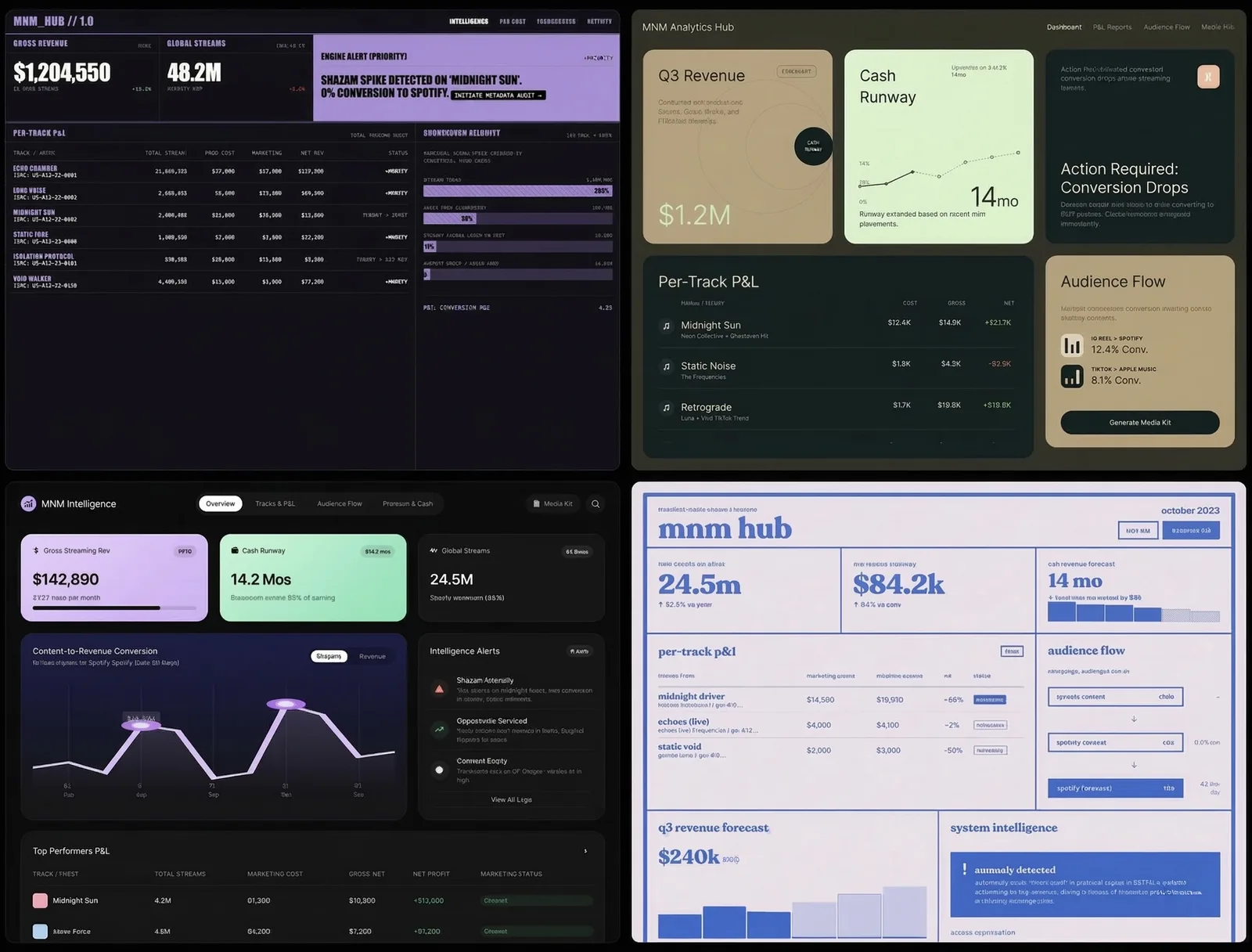
The value of this stage was variety. It gave me concrete options to compare instead of forcing me to invent a complete interface from a blank screen.
Compare the options against explicit questions
I grouped the mockups into six screenshots and asked Claude to describe each one before recommending anything.
Then I gave it questions tied to the product:
- Can the user find revenue and cash position immediately?
- Is the most important chart visually dominant?
- Can track-level performance be scanned without opening another page?
- Are warnings clearly different from ordinary information?
- Which layouts will still work on a narrow screen?
- What information is missing from every option?
This was useful for consistency. Claude could compare the same element across 24 designs without forgetting the criteria halfway through.
But its answer was still a critique, not user research. An AI can notice hierarchy, density, contrast, and repeated patterns. It cannot know whether a music operator will understand the dashboard during a real working day.
Build a new direction from several mockups
No single mockup solved the whole problem.
I kept:
- the compact card structure from one option;
- the main revenue chart from another;
- the darker palette from a third;
- a text feed for warnings and changes from a fourth.
I removed decorative elements that competed with the numbers. I also added states that the first batch had ignored: missing data, delayed reports, negative changes, and a track with no revenue yet.
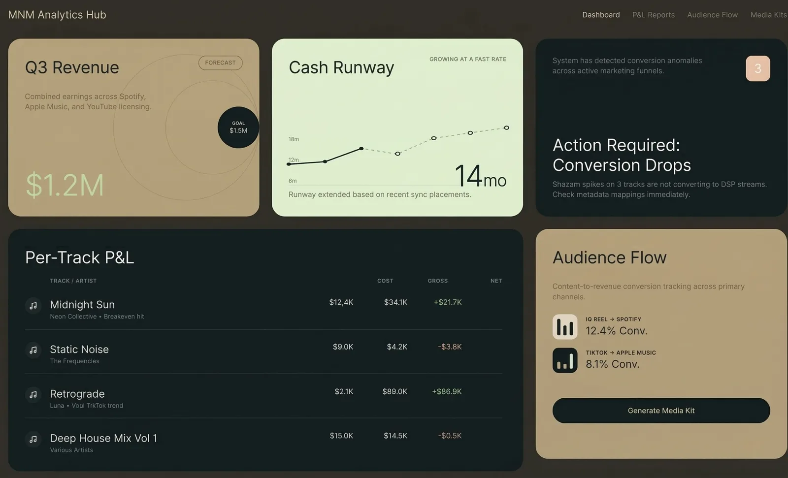
Claude turned those decisions into a more specific prompt. I used that prompt to generate a second, narrower batch in Variant.
The new batch was not automatically better. It was simply closer to the requirements because the prompt now described the information hierarchy, not only the visual mood.
Put real data into the design
A mockup filled with clean sample numbers hides many problems.
Real music data contains long track titles, missing months, zero values, several currencies, delayed royalties, and platforms that use different names for the same release. I exported the selected direction and used it as a starting point for the working dashboard.
The first implementation exposed issues the mockups did not:
- some cards became too tall with real titles;
- the main chart needed a clear reporting-period label;
- revenue and stream changes needed different units;
- missing data needed to look different from a real zero;
- the mobile version needed fewer numbers on the first screen.
Those changes came from the data and the working interface, not from the AI critique.
What each participant contributed
Variant produced visual options quickly.
Claude organized the comparison and helped turn selected elements into a precise second prompt.
I defined the product requirements, rejected weak directions, chose which trade-offs mattered, and decided what to build.
The working dashboard revealed whether those decisions survived contact with real data.
This division matters. Generating and comparing mockups can reduce the cost of exploration. It does not remove the need for product judgment or testing.
The reusable process
define the job
      ↓
generate different options
      ↓
compare them against the same criteria
      ↓
combine useful elements
      ↓
build with real data
      ↓
test and revise
If you want to try it, begin with one screen and five questions the screen must answer. Generate several different layouts. Ask an AI to compare them against those questions, but require it to separate observation from recommendation.
Then build the smallest version with real content. That is where evaluation begins.